This post is about doing data analysis and visualization for the 2017 Doctorate Recipients Dataset and constructing a dashboard with Streamlit for results demonstration. Note that dashboard built with Streamlit originally can only be accessed locally, but we can use Heroku to built a small app and make this dashboard online and public!
My final dashboard can be accessed via this link (it may take some time to load in 😛) and the source codes could be find on my Streamlit-Dashboard branch at GitHub.
The Dashboard
This is the dashboard I built ✨ (Use the chevron-right badge to display the sidebar.)
Details about how to play around with it and how to deploy a dashboard are included respectively in the Visual section and Deployment section below.
Data
The 2017 Doctorate Recipients Dataset is quite a rich dateset and contains a lot of information. My analysis mainly focus on information about recipents and institutions. The tables I used are Table 1, Table 3, Table 5 and Table 6.
Firstly I did some pre-processing for the excel data to make them more suitable for plotting and visualization (details included in the pre-processing notebook).
For the first three tables oprations are quite simple, mainly about formatting.
# table 1
df = pd.read_excel('sed17-sr-tab001.xlsx', skiprows=3)
df.iloc[18,2] = 0
df.to_excel('df.xlsx')

# table 5
df2 = pd.read_excel('sed17-sr-tab005.xlsx', skiprows=3)
df2 = df2.iloc[:-2,:]
df2 = df2.set_index('Rank')
df2.to_excel('df2.xlsx')

# table 3
df3 = pd.read_excel('sed17-sr-tab003.xlsx', skiprows=3)
df3 = df3.set_index('Rank')
df3.to_excel('df3.xlsx')
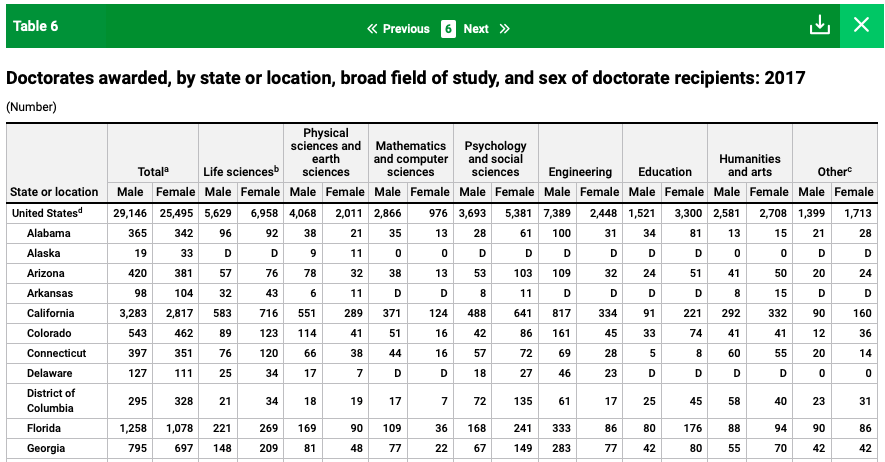
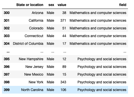
As for the last Table, it is kind of a nested shape, so I transformed its structure a little bit.
Before
After
# table 6
df4 = pd.read_excel("sed17-sr-tab006.xlsx", skiprows=3).loc[1:,].reset_index(drop=True)

def func(i, x):
    '''
    Helper function for data transformation.
    '''

    temp = df4.iloc[:, [0, 2*i+1, 2*i+2]]
    temp.columns = ['State or location', 'Male', 'Female']
    temp = temp.melt(id_vars = 'State or location', var_name = 'sex')
    temp["field"] = x
    return temp

df4_new = pd.concat([func(i, x) for i, x in enumerate(df4.columns[1::2])]).reset_index(drop=True)
df4_new = df4_new.loc[np.logical_and(df4_new["value"] != 0, df4_new["value"] != 'D'),].reset_index(drop=True)
df4_new.to_excel('df4_new.xlsx')
Visual
In general the design of my dashboard is quite flexible.
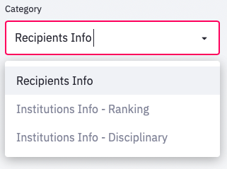
In general there are three main sections/categories: Recipients Info, Institutions Info - Ranking, Institutions Info - Disciplinary, which could be chosen from the scroll-down button in the side bar.
session = st.sidebar.selectbox("Category", ["Recipients Info", "Institutions Info - Ranking", "Institutions Info - Disciplinary"])
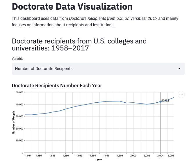
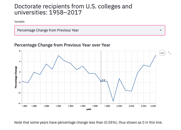
In the Recipients Info category, there are two types of animated graphs for two main variables: Number of Doctorate Recipents and Percentage Change from Previous Year.
The animated labels are achieved by the following codes (templates can de found from the Altair Library):
# Transparent selectors across the chart. This is what tells us
# the x-value of the cursor
selectors = alt.Chart(source).mark_point().encode(
    x='year',
    opacity=alt.value(0),
).add_selection(
    nearest
)

# Draw points on the line, and highlight based on selection
points = line.mark_point().encode(
    opacity=alt.condition(nearest, alt.value(1), alt.value(0))
)

# Draw text labels near the points, and highlight based on selection
text = line.mark_text(align='left', dx=5, dy=-5).encode(
    text=alt.condition(nearest, 'y:Q', alt.value(' '))
)

# Draw a rule at the location of the selection
rules = alt.Chart(source).mark_rule(color='gray').encode(
    x='year',
).transform_filter(
    nearest
)

# Put the five layers into a chart and bind the data
output = alt.layer(
    line, selectors, points, rules, text
).properties(
    width=600, height=300
)
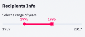
For either plot we can use the slider in the side bar to choose the year range we want to look at:
st.sidebar.subheader("Recipients Info")
year_range =  st.sidebar.slider('Select a range of years',
    min(df.Year+1), max(df.Year), (1990, 2005))
In the Institutions Info - Ranking category, we can checking top-50 rankings about number of Doctorate recipients for either State or University and use the slider on the left to choose our desired range of ranking:
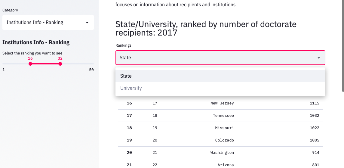
#sidebar
st.sidebar.subheader("Institutions Info - Ranking")
rank_range =  st.sidebar.slider('Select the ranking you want to see',
                                min(df3.Rank+1), max(df3.Rank), (1, 5))

if mode == 'State':
    rank = [i in range(rank_range[0],rank_range[1]+1) for i in df2.Rank]
    filtered = df2[rank]
    st.table(filtered)


elif mode == 'University':
    rank = [i in range(rank_range[0],rank_range[1]+1) for i in df3.Rank]
    filtered = df3[rank]
    st.table(filtered)
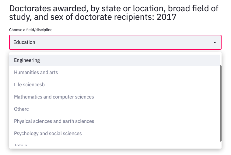
In the Institutions Info - Disciplinary category, we can checking doctorate recipients’ female-male distribution in different states with respect to different fields/disciplines:
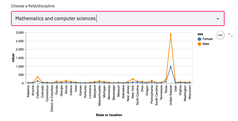
graph = alt.Chart(tmp).mark_line(point=True).encode(
    x = 'State or location',
    y = 'value',
    color='sex:N').interactive()
st.altair_chart(graph, use_container_width=True)
Deployment
The deployment procedure requires opening an account on Heroku, creating a corresponding Github repository, adding some configuration files and a final building. Detailed tutorials could be found on Heroku’s official website and the post attatched How to Build a Streamlit App in Python.