This post is about doing data analysis and predictive modeling for the MIMIC Dataset and constructing a dashboard (deployed on GCP) for results demonstration and interactive prediction.
Detailed source code for this Predictive Modeling project can be found in this GitHub repo. The deployed dashboard can be accessed via this link (may take some time to load in 😛) or you may play with it in the Dashboard section below within this post 👻. Source codes about construction of this dashboard can be found here.
Data
The MIMIC Dataset is an openly available dataset developed by the MIT Lab for Computational Physiology, comprising deidentified health data associated with ~60,000 intensive care unit admissions (53,432 adult patients and 8,100 neonatal patients) from June 2001 to October 2012. It includes demographics, vital signs, laboratory tests, medications, and more.

Project Background
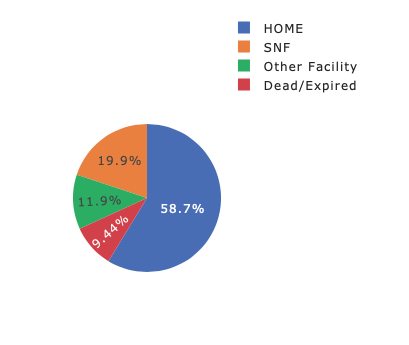
The main purpose of this project is to predict Patients' Discharge Location. More specifically, we want to construct a classification system for discharge location of patients with ICU admission by using machine learning techniques and information about patients’ demographics, vital signs, laboratory tests, medications, etc.
As for relative audience, our project aims to provide help for hospital administration team, inquisitive researchers and curious patients. Our final multi-page dashboard serves as a useful platform for monitoring occupancy and clinical results of patients with comprehensive visual demonstration. Moreover, the online ML prediction section of our dashboard provides real-time results of clinical outcome, which could greatly assist in the decision-making process of patients and doctors.
The datailed benefits are summarized as below:
- Provide information about hospital utilizations, such as hospital bed occupancy and other key resources as a clinical decision system.
- Predict clinicians of the mortality rate of patients at the admission of hospital so health providers can be well informed as they perform clinical procedures.
- Display the predictions by dashboard and inform the clinicians of the overall trend of hospital utilizations.
- Decrease the risk of adverse hospital-acquired events, and improve scheduling and satisfaction for patients.
ETL, EDA, Data Cleaning & Feature Engineering
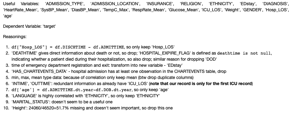
We downloaded data from the MIMIC-III Clinical Database (note that some to access this database, you must do some required training to become be a credentialed user for this website), combined ICU stay information about demographics data and vital signs with laboratory test results via GCP BigQuery. Most of the ETL process was done by my teammate Zhenhui and details are included in the Querying and Merging Raw Dataset section of her post here. In summary, we used 46,520 patients’ records from the original MIMIC database. These patients were admitted to intensive care units from June 2001-October 2012. Note that only the first record of ICU stay was kept if a patient had multiple ICU stay records. As for preparation of Training and Testing Dataset, we used 20% of the original 46,520 records as our testing data with a random seed of 123 and with maintenance of the original target variable distribution.
X = df_new.loc[:, df_new.columns != 'target']
y = df_new['target']
X_train, X_test, y_train, y_test = train_test_split(X, y, test_size=0.2, random_state=123, stratify=y)
Next, I continued with the extracted and collected csv files, did some EDA and made some data cleaning and transformation in preparation for the ML task later (detailes can be found in this notebook):
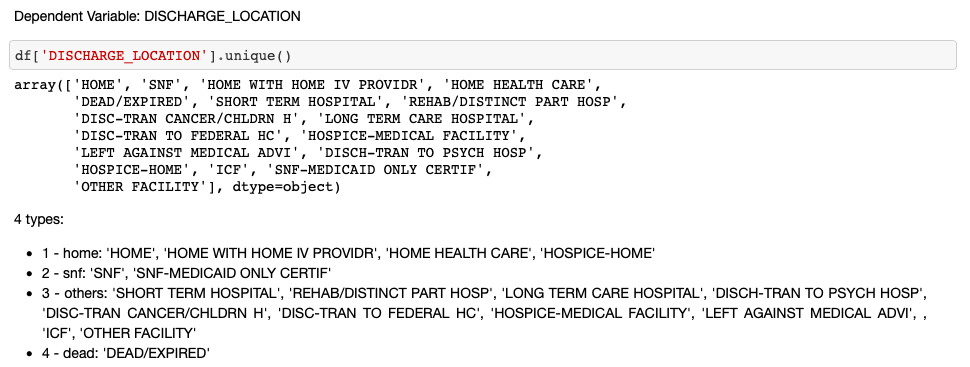
- Step 1. Target Variable Re-Classification and Encoding
# target variable encoding
result = []
for value in df['DISCHARGE_LOCATION']:
    if value == 'DEAD/EXPIRED':
        result.append(4)
    elif 'HOME' in value:
        result.append(1)
    elif value.startswith('SNF'):
        result.append(2)
    else:
        result.append(3)

df['target'] = result
- Step 2. Time/Date Related Variable Re-Formatting
# time in emergency department, if not enter, then 0
df['EDREGTIME'] = df['EDREGTIME'].fillna(0)
df['EDOUTTIME'] = df['EDOUTTIME'].fillna(0)
df['EDstay'] = pd.to_datetime(df.EDOUTTIME) - pd.to_datetime(df.EDREGTIME)

df['Hosp_LOS'] = pd.to_timedelta(df.Hosp_LOS).dt.total_seconds()
df['EDstay'] = df.EDstay.dt.total_seconds()
- Step 3. Variable Selection basing on Logic
df_new = df.drop(['DISCHARGE_LOCATION', 'SUBJECT_ID', 'HADM_ID', 'icustay_id',
                  'ADMITTIME', 'DISCHTIME', 'DEATHTIME', 'EDREGTIME', 'EDOUTTIME',
                  'HOSPITAL_EXPIRE_FLAG', 'HAS_CHARTEVENTS_DATA',
                  'HeartRate_Min', 'HeartRate_Max', 'SysBP_Min', 'SysBP_Max',
                  'DiasBP_Min', 'DiasBP_Max', 'RespRate_Max', 'HeartRate_Mean_1',
                  'HeartRate_Min_1', 'Glucose_Max', 'Glucose_Min', 'INTIME', 'OUTTIME',
                  'DOB', 'DOD', 'LANGUAGE', 'MARITAL_STATUS', 'Height'], axis=1)
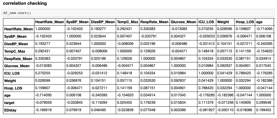
- Step 4. Correlation Checking and Further Variable Analysis & Transformation
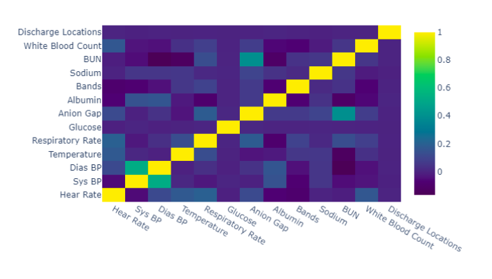
- Step 4.1 One-Hot Encoding
df_new = pd.concat([df_new, pd.get_dummies(df_new['ADMISSION_TYPE'])], axis=1).drop(
    'ADMISSION_TYPE', axis=1)

df_new = pd.concat([df_new, pd.get_dummies(df_new['ADMISSION_LOCATION'])], axis=1).drop(
    ['ADMISSION_LOCATION', '** INFO NOT AVAILABLE **'], axis=1)

df_new = pd.concat([df_new, pd.get_dummies(df_new['INSURANCE'])], axis=1).drop(
    'INSURANCE', axis=1)

df_new = pd.concat([df_new, pd.get_dummies(df_new['RELIGION'])], axis=1).drop(
    ['RELIGION', 'NOT SPECIFIED', 'CATHOLIC', 'PROTESTANT QUAKER',
       'UNOBTAINABLE', 'OTHER', "JEHOVAH'S WITNESS",
       'GREEK ORTHODOX', 'EPISCOPALIAN', 'CHRISTIAN SCIENTIST',
       'METHODIST', 'UNITARIAN-UNIVERSALIST', 'HEBREW',
        'BAPTIST', 'ROMANIAN EAST. ORTH',
       'LUTHERAN'], axis=1)

df_new = pd.concat([df_new, pd.get_dummies(df_new['GENDER'])], axis=1).drop(
    'GENDER', axis=1)
result = []
for value in df_new['ETHNICITY']:
    if 'ASIAN' in value:
        result.append('ASIAN')
    elif 'WHITE' in value:
        result.append('WHITE')
    elif 'BLACK' in value:
        result.append('BLACK')
    else:
        result.append('ETHNICITY_Others')

df_new['ETHNICITY'] = result
df_new = pd.concat([df_new, pd.get_dummies(df_new['ETHNICITY'])], axis=1).drop(
    'ETHNICITY', axis=1)
result = []
for value in df_new['DIAGNOSIS']:
    if value == 'PNEUMONIA':
        result.append('PNEUMONIA')
    elif value == 'CORONARY ARTERY DISEASE':
        result.append('CORONARY ARTERY DISEASE')
    elif value == 'SEPSIS':
        result.append('SEPSIS')
    elif value == 'INTRACRANIAL HEMORRHAGE':
        result.append('INTRACRANIAL HEMORRHAGE')
    elif value == 'CHEST PAIN':
        result.append('CHEST PAIN')
    elif value == 'CORONARY ARTERY DISEASE\CORONARY ARTERY BYPASS GRAFT /SDA':
        result.append('CORONARY ARTERY DISEASE\CORONARY ARTERY BYPASS GRAFT /SDA')
    elif value == 'GASTROINTESTINAL BLEED':
        result.append('GASTROINTESTINAL BLEED')
    elif value == 'CONGESTIVE HEART FAILURE':
        result.append('CONGESTIVE HEART FAILURE')
    elif value == 'ALTERED MENTAL STATUS':
        result.append('ALTERED MENTAL STATUS')
    else:
        result.append('others')

df_new['DIAGNOSIS'] = result
df_new = pd.concat([df_new, pd.get_dummies(df_new['DIAGNOSIS'])], axis=1).drop(
    ['DIAGNOSIS', 'others'], axis=1)
- Step 4.2 Missing Data Imputation: ‘HeartRate_Mean’, ‘SysBP_Mean’, ‘DiasBP_Mean’, ‘TempC_Max’, ‘RespRate_Mean’, ‘Glucose_Mean’, ‘Weight’ needs further imputation and evluation of imputation methods are checked by logistic regression. After attemption, I found
Univariate Feature Imputationworks the best on our data (Multivariate Feature Imputation doesn’t perform well and Nearest Neighbors Imputation tends to overfit.) Note: Variables with too much missing (>50%) are totally removed.
df_new['ICU_LOS'] = df_new['ICU_LOS'].fillna(0)

imp = SimpleImputer(strategy='mean')
imp.fit(X_train)
X_train1 = imp.transform(X_train)
X_test1 = imp.transform(X_test)
Model Building
As for the model building part, each of our team members took charge of certain models (notebooks can be found here). I mainly attempted Logistic Regression and SVM (notebook for these two models).
Below is my attemption procedure:
- Step 1. Firstly check whether this data is linearly seperable by using a Perceptron and check its performance
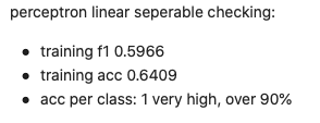
As indicated by the results above, compared to the dummy classifier (59% accuracy), perceptron model could achieve about 64% accuracy, indicating that common models for linearly seperable data like Logistic Regression and SVM with linear/poly kernel are quite worth trying.
-
Step 2. Next I attempted to do some clustering checking by the
Elbow Method(WCSS plot with K-means) and found that there indeed exist 4 clusters for our data. Then I attempted to addresultsof a K-means model with 4 clusters as a new feature, but simple checking with LightGBM (used this model for checking beacuse it is very fast to run) showed that adding such a feature would not improve accuracy. -
Step 3. Therfore, I kept using the features we engineered as in the
ETL, EDA and Data Cleaningsection and startedSVMmodel tuning. I firstly attemptedRandom Grid Searchbut this method actually did not help a lot with tailoring good parameters. Thus, I kept using3-fold Grid Search(used 3-fold for speed and to avoid overfitting) for parameter fine tuning. I attempted multiple grid search plans basing on previous plan’s result (one example search plan is shown below) and the final paremater set is as the following:{'C': 1.0, 'decision_function_shape': 'ovo', 'degree': 5, 'kernel': 'poly'}.
# Create the parameter grid based on the results of random search
param_grid = {
    'C': [0.8, 1.0],
    'kernel': ['poly'],
    'degree': [2, 3, 4, 5],
    'decision_function_shape': ['ovo']
}
# model
svm = SVC()
# Instantiate the grid search model
grid_search = GridSearchCV(estimator = svm, param_grid = param_grid,
                          cv = 3, n_jobs = -1, verbose = 2, scoring='accuracy')

grid_search.fit(X_train, y_train)

# best parameter set
grid_search.best_params_
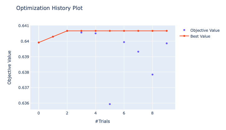
- Step 4. As for
Logistic Regression, I attemptedOptunafor parameter tuning (optimization history plot is shown below) and the final parameter set is{penalty='l1', solver='liblinear', multi_class='ovr', random_state=0, C=0.9706}.
Model Comparison
Model Performance for training and testing data are shown below:
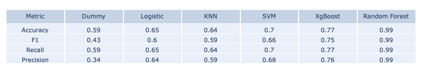
- Training Data Set
- Testing Data Set
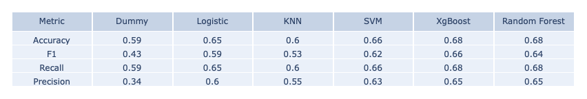
The main measure we consider is classification accuracy and as we can see above, XgBoost and Random Forest both give the highest testing accuracy. However, Random Forest overfits a lot on the training data set and is slighter lower in the F1 score. Therefore, we chose the XgBoost model as our final model for making predictions and building online ML platform.
Dashboard
This is the multi-page dashboard we built 👇 , you can explore it freely 😀
✨ Details about the construction of this dashboard could be found in this GitHub Repo and explanation about deployment on GCP can be found in the Deployment section below.
As you can see from the upper-right EXPLORE badge, our dashboard have five main sections:

- You can access homepage via the
Homelink as shown above or by clicking the dashboard titleMIMIC PREDICTIVE MODELING. - TheEDAsectioin includes a lot of visualization for the original MIMIC data set. - The
Modelspart is about results of the models we attempted. - The
Calendarsection shows a calendar layout of prediction results which could be of significant importance to care managers. - At last, the
Online MLsection is our responsive real-time pediction app. Users can enter different combination of inputs and get immediate prediction. Note that only 10 features are listed in this app (first five are the top-5-importance ones in our best XgBoost model, last five are the ones we view as importance from our domain knowledge), the other features for computation are using the mean and mode of the testing records.
As for the structure of the multi-page layout, we followed this tutorial. index.py controls the main page layout and app.py is about server connection. Construction files for each section can be accessed in the ‘apps’ folder of our dashboard repository. I’m mainly in charge of the Models section, whose source code coube be find in the ‘Models.py’ file.
Note that I organized this document by: 1. import libraries at first, 2. writing different functions for plotting 3. load in data, 4. mian layout, 5. call back functions for input-output interaction. Here are some glimpse of the code I written 👀 :
- example function for making Plotly plots
# function1
def plot_confusion_matrix(cm, labels):
    '''
    Function for plotting confusion matrix (normalized).

    cm : confusion matrix list(list)
    labels : name of the data list(str)
    title : title for the heatmap
    '''

    data = go.Heatmap(z=cm, y=labels, x=labels)
    annotations = []
    for i, row in enumerate(cm):
        for j, value in enumerate(row):
            annotations.append(
                {
                    "x": labels[i],
                    "y": labels[j],
                    "font": {"color": "white"},
                    "text": str(value),
                    "xref": "x1",
                    "yref": "y1",
                    "showarrow": False
                }
            )
    layout = {
        "xaxis": {"title": "Predicted value"},
        "yaxis": {"title": "Real value"},
        "annotations": annotations,
        "margin": dict(t=0)
    }
    fig = go.Figure(data=data, layout=layout)
    return fig
- example widget
# Radio Item for input selection

dbc.FormGroup(
        [
            dbc.Label("Classifiers with built-in importance ranking:"),
            dbc.RadioItems(
                id='classifier2',
                options=[
                    {'label': 'Logistic Regression', 'value': 'logreg'},
                    {'label': 'XgBoost', 'value': 'xgb'},
                    {'label': 'Random Forest', 'value': 'rf'},
                ],
                value='xgb',
                inline=True
            ),
        ]
    ),
- example call back function
@app.callback(Output('imp1', 'figure'),
              [Input('classifier2', 'value'), Input('num_of_feature', 'value')])

def update_graph2(classifier2, num_of_feature):

    target_label = ['DEAD/EXPIRED', 'HOME', 'OTHERS', 'SNF']

    # different model
    if classifier2=="logreg":
        df_imp = pd.read_csv('./Data/logreg_importance.csv', index_col=0)
        fig3 = plot_multi(df_imp, num_of_feature)

    elif classifier2=='xgb':
        df_imp = pd.read_csv('./Data/xgb_importance.csv', index_col=0)
        fig3 = plot_imp_single(df_imp, num_of_feature)

    elif classifier2=='rf':
        df_imp = pd.read_csv('./Data/rf_importance.csv', index_col=0)
        fig3 = plot_imp_single(df_imp, num_of_feature)

    return fig3
Deployment
Lastly, we deployed our dashboard to GCP - Google Cloud Platform. The whole procedure is similar to what I did for the Streamlit App deployment on Heroku in one previous post: 1. opening an account on GCP, 2. creating a corresponding Github repository for dashboard construction, 3. adding some configuration files, 4. a final building.
A detailed tutorial about how to package your model with the EDA part can be find here and this is the post we followed for adding configuration and conducting final deployment. More details about how exactly we deployed this whole dashboard can be found in Zhenhui’s post here.
Final Words
To sum up, this project is our final project for Duke BIOSTATS823 Fall 2020 course. It is really a very comprehensive project mimicing nearly all parts of a whole Data Analysis and Product Deployment procedure. We worked in a group of four in a two-months’ duration with continuous collabration and bi-weekly meeting. We have used a lot of data science techniques in this experience: SQL, pandas, missingno, optuna, xgboost, scikit-learn, matplotlib, pyplot, seaborn, dash, docker, gcp, etc. A very enjoyable data science diving experience and thanks for reading! 🥂